This will be the first in a series. I want to document as I go. I know that you will agree when I say that people tell me I am nuts to be concerned with a kitchen in a rental apartment. My response to this is that I have to live with this kitchen every day just as any homeowner does. I am doing as much of it myself as I possibly can. I have employed the help of a few friends and neighbors as well. My kitchen is attached to the living/dining area. So I do not have the luxury of closing a door to avoid it. I do like the fact that I can be cooking or doing dishes a still be in the same room with my girls.
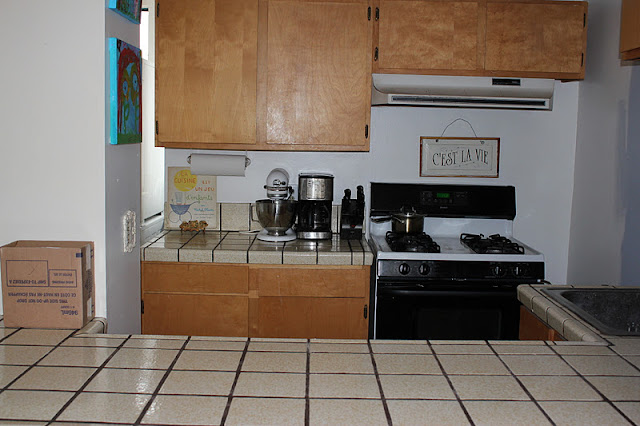
Here is what we are starting with. As you can see, I am playing around with color, which I do quite a bit more than a normal person :). My kids' joke is that they go to bed and the apt is one color. When they awaken it is a completely different hue.
I understand that this is nice wood. I can appreciate that. But if you know me or have even read my blog once you are aware that it is just not my style.
I was not planning for these pics to be before shots so please excuse the mess as well as poor quality on the one below.
This is the view from the living/dining room.

So I started out by painting the walls. They are better than the chiffon yellow but I am not that happy with the color I chose. I may change that, but that is pretty easy since the room is tiny. Then I moved on to the cabinets. This proved to be the most difficult part by far. If I actually dragged you through all of the hideous details you may cry, so let's not risk that. I did not do an outstanding job at all. But in my opinion, it is a vast improvement. I painted them white and added new stainless steel looking hardware. I know also that hardware can be terribly costly. I went to Home Depot and found these very simple and affordable hinges. Eventually I would like to add picture frame moulding to the cabinets. But for now this is just fine.
View from the hallway |

I then added wainscoting to the underside of the kitchen counter. I painted it a shade of white that I am pretty happy with called Mountain Peak White by Benjamin Moore, same color as the cabinets. It took quite a few coats of paint, and could probably stand to have a few more. But the difference it made to the room visually cannot be overstated!
So, the next step is the lighting. Here is what is currently in place.
And here is the photo from
Mothology in New York for the pendants which I am replacing these beauties with. My stepfather is making the "box" from which they will hang and will bring it to me in February when he and my mom visit next. Cannot wait! They were sold out of the far left one. I had hoped for one of those and two of the hobnail, or center ones. So, impatient as I can be, I chose three of the latter. Aren't they beautiful? I love that mercury glass is dubbed "poor man's silver."
The next step will be the most glaring offense, the countertops. I have chosen oak. I like the feel of butcher block. But I am especially drawn to the darker color of oak. I need to do a bit more research, and saving of funds ;) for this part but I have plenty to do in the meantime. And in a perfect world I would like an apron sink.
This is not a one week project...or even one month. I am enjoying the process as opposed to rushing to the finish line. Isn't that the point?
xo
Michele


